Waze Redesign
How can we make waze a better copilot?
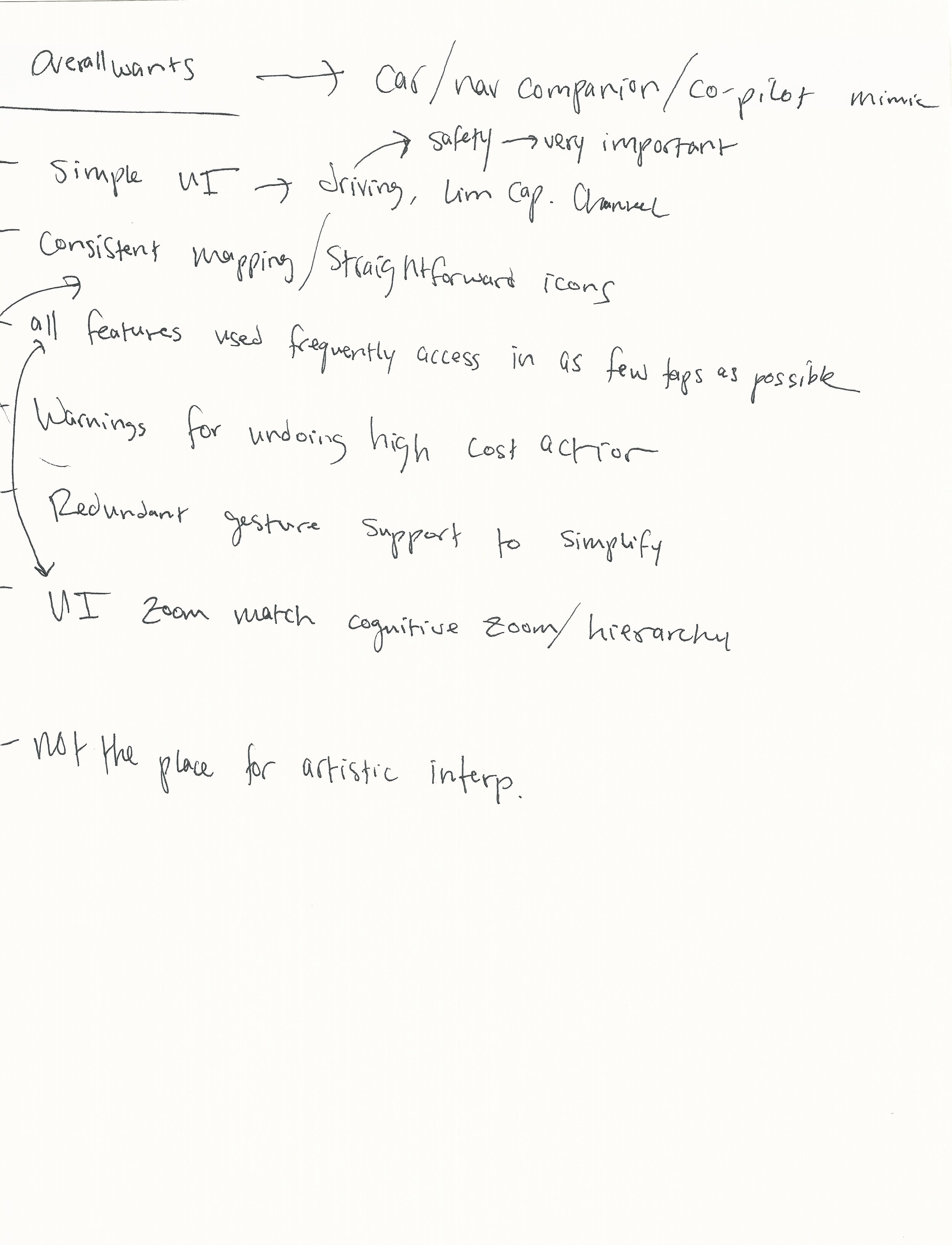
Waze is all about providing the user with useful information — often while they are driving. As a result, the Waze experience should be as straightforward and low friction as possible to minimize distractions. I chose to redesign Waze because it is one of the most useful apps on my phone, yet presents a significant safety risk in its complicated User Interface.
Current Design Overview (2019)
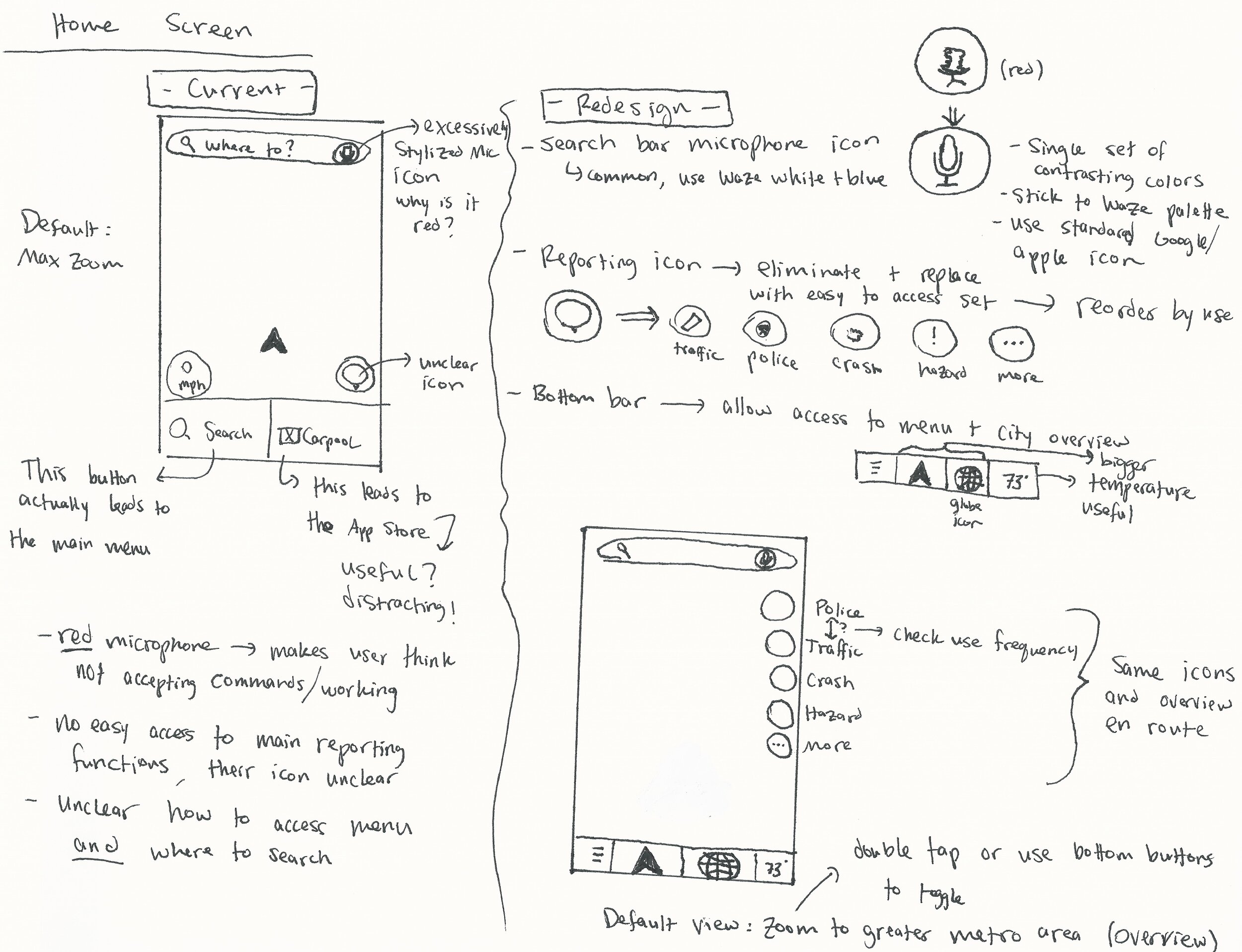
Waze is overwhelming, especially at a quick glance down from the road. While the app contains troves of valuable driver information, it is not easily accessible. The current User Interface is lacking in consistent cognitive mapping, attention to cognitive hierarchy, attention to cognitive zoom, straightforward iconography, and easy access to frequently used features.
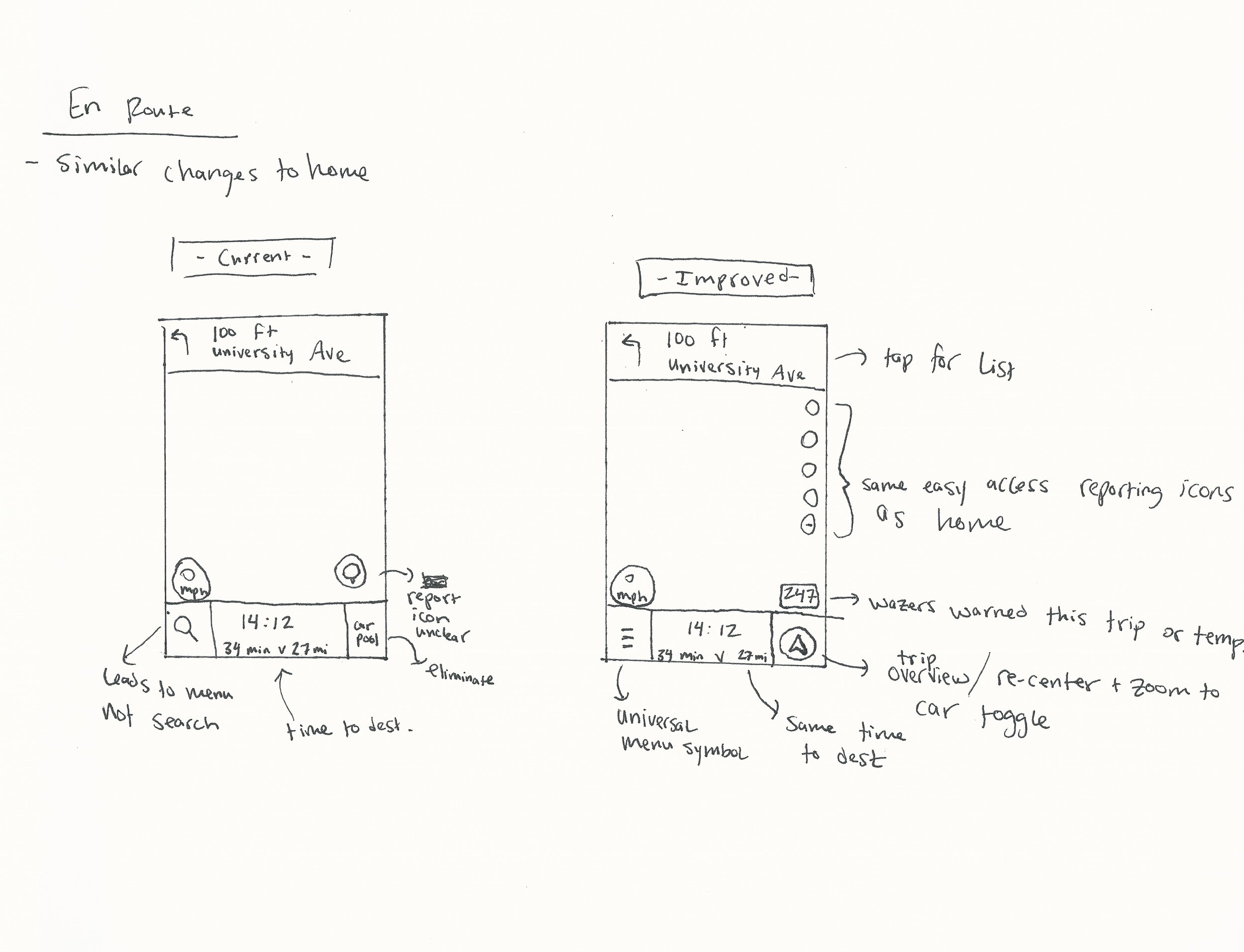
Home and En Route
The bottom bar is misleading and takes up significant real estate for infrequently used features — “Carpool” is a link to the external Waze Carpool app and “Search” actually leads to the app’s main menu rather than a dedicated search function.
The orange speech bubble icon is unfamiliar and therefore ambiguous at a glance. It leads to the reporting function for police, traffic, accidents, etc. Considering that crowd-sourced reports are Waze’s primary competitive advantage as a navigation app, this feature should be directly accessible.
The map default zoom is the maximum, which gives the user very little information.
Search
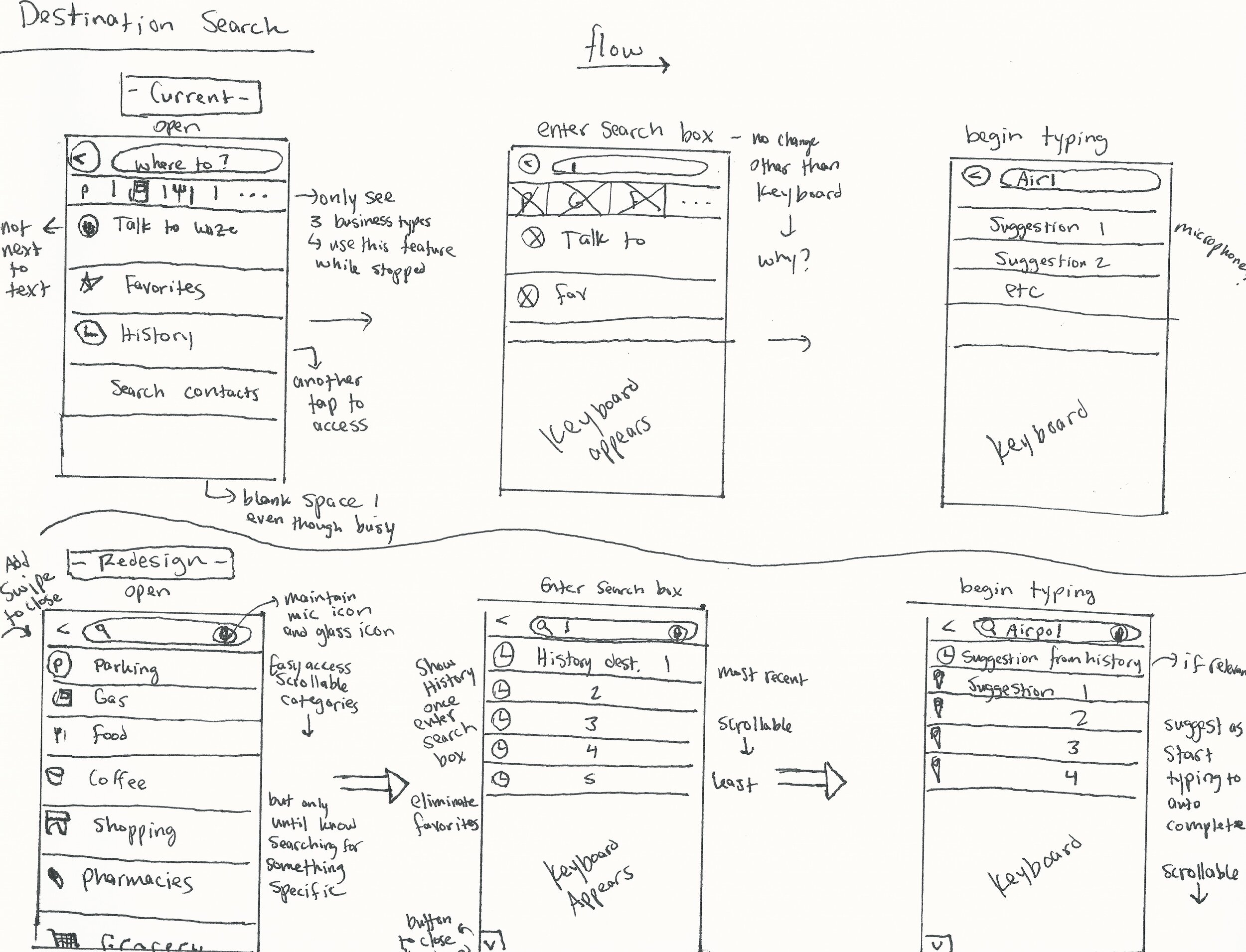
The user’s intention can be inferred by whether they have entered the text box or not, yet content is identical before and after entering the box.
The microphone icon is relocated from its previous location in the search bar, requiring additional attention.
Multiple taps and menus are required to access any of the destinations other than parking, gas, food, and coffee, which are three of many destination categories.
Main Menu
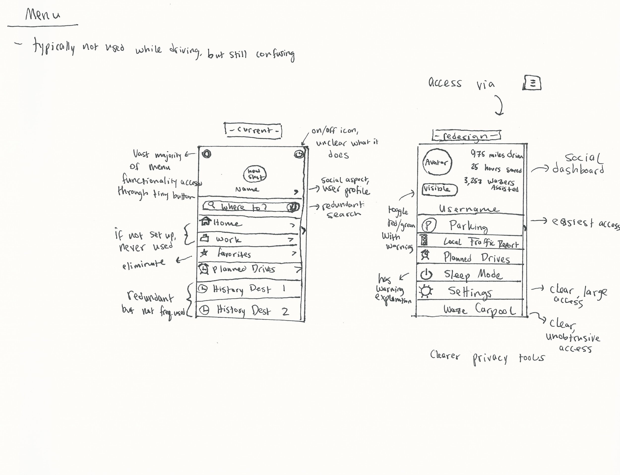
The search and history functions are redundant from the main search function yet do not make the app easier to use.
The settings button, which contains most of the menu’s functionality, is extremely small.
The sleep mode button uses a universal icon for a non-universal function within mobile applications and is therefore unclear.
Redesign Decisions and rationale
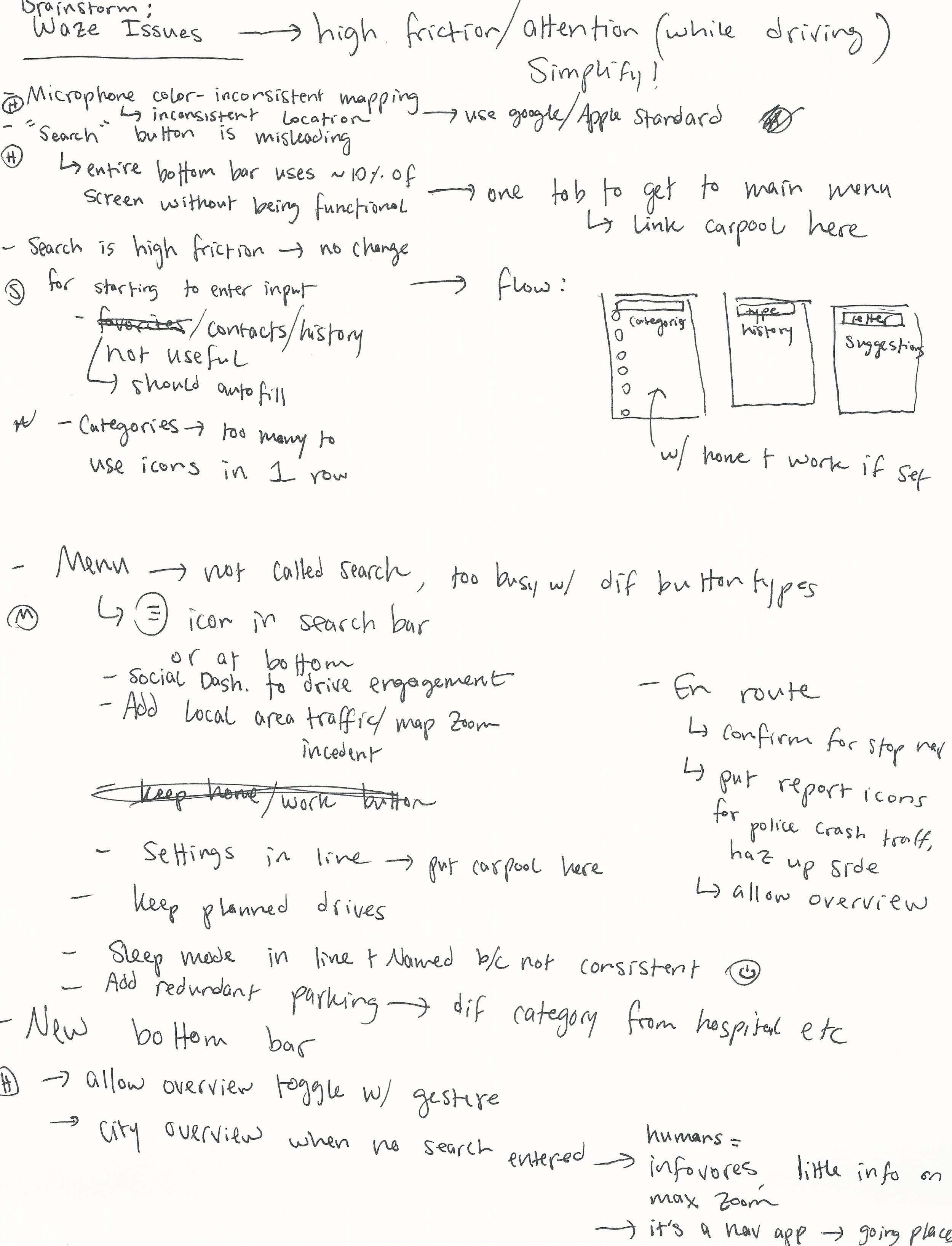
Across all parts of the app, I sought to simplify and minimize chances of distracted driving. This included numerous changes to better anticipate the user’s intentions and access to controls with fewer taps to minimize interaction time.
Home and En Route
The bottom bar includes a standard menu icon in place of the misleading search icon. It also uses enlarged buttons to toggle between a metro area/trip overview and maximum zoom on the user’s location. This is a key function missing in the current app, as the lack of information on maximum zoom is frustrating for users. A more global zoom to the metro area or trip level provides much of the useful information that drives Waze use such as traffic, accidents, and locations of police.
The ambiguous orange reporting icon is eliminated and replaced with buttons for the four most common report types, plus a “more” button along the right side. Reporting is a key advantage of Waze but by definition happens while the vehicle is in motion. Therefore, requiring an additional tap and scan of the reporting menu is unacceptable. After the redesign, users can report features with a single tap.
The red microphone icon in the search bar is replaced with a standard microphone icon which employs the Waze color scheme. This change decreases the attention required to recognize the speech input function and eliminates a tendency to believe dictation is not available due to common uses of the color red for non-functioning items.
Search
The dictation feature is maintained within the text box as designed on the home screen, decreasing required attention.
The initial open screen is modified to include only destination categories. The user would likely only want to search categories if a specific destination is unknown and therefore not being entered in the text box. The categories are scrollable for easy access with fewer taps, as they are numerous.
Once the user enters the search box, recent history is shown in scrollable form. Because the user has entered the search box, they likely have a destination in mind and can potentially save time by selecting rather than typing it. Because the user has a specific destination in mind, categorical browsing is hidden. “Search contacts” as a standalone feature is eliminated.
Once the user begins typing, suggestions are tailored to the entered input. Waze searches destination history as well as contacts’ addresses, if allowed, to help autocomplete the correct destination. History is ranked by relevance instead of recency as the user has entered relevant input.
Menu
The menu is redesigned overall to show information that is more unique and relevant.
The tiny settings and sleep buttons are relocated from the top of the screen to the main menu list. This allows easier access to both while indicating to the user that the on/off icon represents sleep mode, which was previously ambiguous. Sleep mode has a subsequent warning explanation box to clarify and avoid accidental activation.
Waze Carpool is relocated to the menu, which still provides users easy access to the new app without distracting from navigation or risking accidentally exiting the navigation app while driving.
Planned drives is maintained as is.
A local traffic and incident report feature is added, as the necessary data is already part of the app but not accessible in report form. Users generally favor being maximally informed of surroundings.
A redundant parking button allows users to easily access the most frequently used destination category.
The top account box is completely redesigned to better leverage the social nature of the Waze app. The avatar is augmented by statistics on the Waze’s benefit to the user as well as the user’s benefit to other users, incentivizing use. Additionally, the location tracking visible/invisible mode is made more obvious, increasing user privacy and data transparency.


